How to Utilize the Dashboard
Learn how to read and use your dashboardDASHBOARD OVERVIEW
The dashboard is a way for you to quickly see what may need your attention. It organizes past due schedule items and items that are coming do so you can see what’s what. You can get the details for any of the information displayed by drilling down further, which we will cover in a moment. In addition there is a fuel chart that will show you over time your fuel efficiency.
GRAPHS
The pie chart will always be displayed at the top right of your dash board and provides three key pieces of information.
The legend of the pie chart is displayed in the center and changes to reflect all three colors
Red – indicates the number of items that are past due and need your attention.
Yellow – Indicates items that are coming due in the next 30 days.
Orange – Indicates items that are coming due in the next 31 to 90 days

12 Month Snap Shot
This view will show you what is behind you as well as in front of you from a maintenance schedule perspective. Our current month will always be in the center so the left of the chart is past due (red circles) and the right of the chart is coming due. The color of the bar will always be red where there are items that are past due and need your attention

In the example above – assume it is currently mid March
Red Circles – Indicate the number of items past due in that particular month. So in the example above there are 3 scheduled maintenance items from LAST November that were not performed and are past due.
Yellow Circles – indicate the number of items due in the next 30 days and will show up in the next month
Orange Circles – indicate the number of items due in the next 31-90 days and will show up in the next two months.

By hovering your mouse over the colored circle you can see exactly what the items are.
12 month Snapshot Detail By Equipment
To drill down into the next level of detail to see what exactly is what is past due and what is coming due, you can hit the View Details button which will take you to the “View Schedule” Page under the “Equipment Tab” ![]()

This view will show you the same 12 month snapshot format from the dashboard, but there will be a bar chart for each piece of equipment. In the above example for AIR CONDITIONING:
- The red circle indicates something is past due from January
- The Orange Circle indicates something is coming due in May
- The the fact the entire bar is red, is due to the fact that there must be an item past due BEFORE last October
You can get to the next level of detail by hitting the down arrow icon ![]()
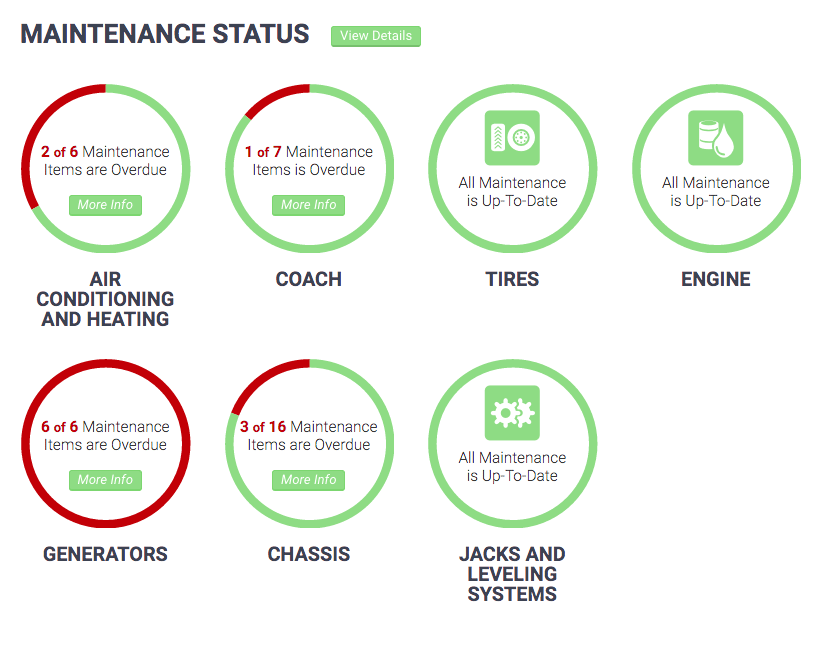
Maintenance Status View
This view will quickly show you the status of any past due items by each piece of equipment you have defined in your schedule. You can quickly see how many items out of the total items you have defined are past due. Or that in fact none are past due
Fuel Chart View
This view will show you how your vehicle is consuming fuel over time. You can use this information to make several adjustments that have an impact on how efficient your vehicle is on fuel usage.

The chart will show each fueling you perform, when they occur in the same month you will see the month repeated on the chart as in the example above. You can further view the details by clicking on the “View Details” button which will take you to the Fuel Log.
Get In Touch
Finding what you need? We are here to help and welcome any questions for feedback you have.